
Constant Evolution
The Story Behind the Design of the New Nissan 370Z
Automotive design is a highly specialized process, as much of an art as it is a science. It is also often an intense competition among carefully selected exterior or interior design specialists. So when it came time to create the next generation of Nissan’s iconic Z – a completely original sports car that has come to symbolize Nissan – a competition was held. Only unlike normal Nissan design competitions, this one was open to anyone in Nissan’s design operations, regardless of title, specialty or experience.
|
The rules of the competition were simple. Entrants had to use free time outside work to
prepare their designs. With its strong Japanese roots and blending of inner strength and
delicacy, the shape of the Nissan Z has evolved over several generations. But each
generation has retained the basic stance and air of the original, identifiable at a glance as a
Z.
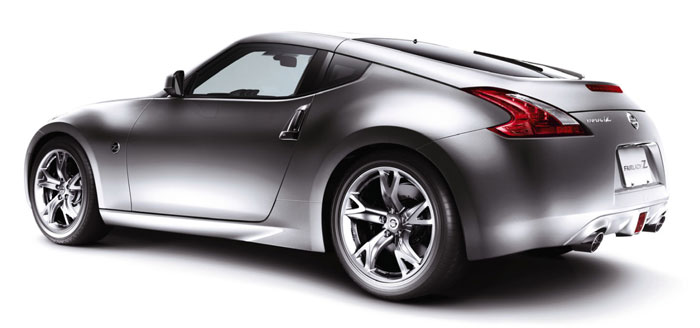
"We received over 100 sketches from around the world, all brimming with 'Z-ness.' No verbal explanation is needed to see that 'Z-ness' has been rooted in the mind of every designer," says Kazuki Yamazaki, the designer in charge of the Nissan Z exterior. The new Z design reflects the input and passion of these many contributors. The design of the new Z focuses on functional beauty, the excess trimmed away, leaving the image of a toned, athletic body. The body has been downsized, the result of in-depth discussions on achieving the ideal functionality for a sports car and the best proportions for rear-wheel-drive. The new |
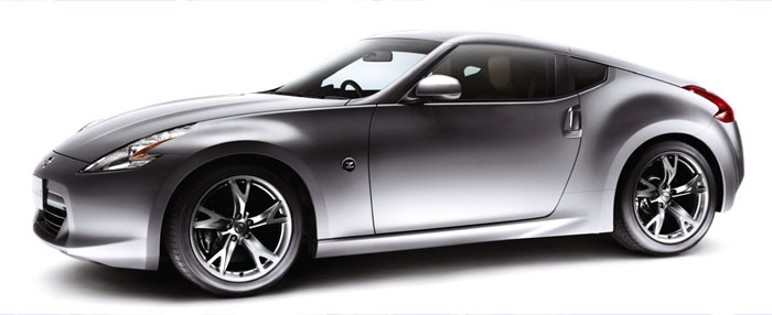
| The character line running from the front fender rearward reaches its peak at around the middle of the hood. The midline curve gently falls from the front and rises again in the rear, following the line of the driver's relaxed arms on the wheel. The boomerang-shaped headlights and taillights catch the bodylines firmly and guide them toward the wheels in a rhythmic flow. | 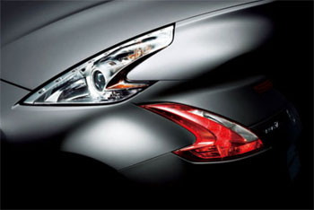 |
 |
To create the image of a strong, athletic body, Nissan gave the Z what no other car has , a well-balanced combination of concave upper and convex lower side panels, with all excess trimmed away. The resulting character lines also express the Z’s low, sporty center of gravity. |
Clay models were especially important in the design of the new Z to create body surfaces that could only come from the sensitivity of human hands. Designers and modelers worked together to create surfaces that digital reproduction can't capture, expressing warmth, strength and excitement.
"Body colors play an important role in expressing the unique statement of each model. The colors must perfectly suit the shape of the car, properly rendering the car's design concept, and maximizing the beauty of the body shape," says Mika Mizutani, color designer in charge of the Z, who had worked on the previous generation Z as well.
In developing exterior colors, the color designer and exterior designer conferred often on the textures of body surfaces and similar subjects. Three new colors were developed for the new Z, but the new Z's 'communication color,' used in catalogs, TV commercials and the like, is the Blade Silver – which best expresses the Z's toned, muscular body. This color was used for the previous Z, but looks quite different on the new body.
"I started working on the new Z from the concept stage, when we chose an expression to describe the model that might seem like a contradiction: 'Cool intelligence and passion,'” she explains. “As I designed the Z's colors, I thought long and hard about what would best express that concept.”
In developing exterior colors, the color designer and exterior designer conferred often on the textures of body surfaces and similar subjects. Three new colors were developed for the new Z, but the new Z's 'communication color,' used in catalogs, TV commercials and the like, is the Blade Silver – which best expresses the Z's toned, muscular body. This color was used for the previous Z, but looks quite different on the new body.
"While we were proud of the previous Z’s interiors, of course, we made it a priority to improve the textural qualities in the new Z,” says Mizutani. “The Persimmon Orange interior color is an evolved version of the iconic color from the previous Z. Combined with a Blade Silver body it perfectly expresses ‘Z-ness,’ meaning intellectual strength and hidden passion.”
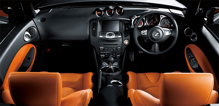
Customers demand high performance and originality from the Z in every aspect, not just driving. The designers harmonized the interiors with the hues and texture of the bright details, building a sense of both unity and textural quality for the interiors through fine details like the shapes of the knobs on the center cluster.
The seats were designed to provide the firm grip needed for comfortable driving, rather than as an expression of luxury. For the optimum driving position, the seats are upholstered in a grippy, suede-like fabric developed especially for the Z.
To improve interior textural qualities, Nissan Research developed a special material called Soffiless, which simulates the softness of human fingers. It is applied by hand to the Z’s center cluster, providing both smoothness and durability.
"The Z has no excess. Every part has meaning and function, even the emblems. I wanted to take them beyond mere symbols and make them functional," says Yusuke Tsuji, the Z's emblem designer.
The emblems on the Z mean more than most because it is one of only four models on which Nissan allows original emblems, separate from the unified Nissan emblem on the rest of the lineup. The others are the Cube, the GT-R and the President.

Because of its importance in expressing the Z, development of the new emblem involved close discussion from the very start. To give it function, it was integrated into the turn indicator in a design that represents the essence of the new Z. It is thicker than the emblem of the previous Z, featuring a line in the center of the Z relief. This symbolically applies the concave-convex combination of body shapes to express the flexibility and strength of an athlete.
"Working to express the Z's qualities, we found ourselves unconsciously going back to the original Z (the S30)," says Yamazaki. “Inheriting the strength and grace of its predecessors, the Z achieves a new stage of evolution. Its breathtaking functional beauty will unforgettably touch the hearts of many.”
|
Kazuki Yamazaki Product Design Division Yamazaki joined Nissan in 1992. Inspired by the Z32, which he encountered as a student, he decided to be a car designer. He says he has greater passion for the Z than anyone. |

|
|
Mika Mizutani Assistant Manager, Color Design Division Mizutani joined Nissan in 1982. She took the company entrance exam for the architectural division, but was assigned to the design division. After working on emblems and wheels, she became a color designer and took charge of colors of the previous Z. |

|
|
Yusuke Tsuji Interaction Design Division After studying graphic design, Tsuji joined Nissan as a graphic designer in 2000. He designs symbols, emblems and a wide range of objects. |

|
Nissan Design Newsletter, Volume 5
http://www.nissan-global.com/EN/DESIGN/NEWSLETTER/
###